Monday, November 29, 2010

MergerShark

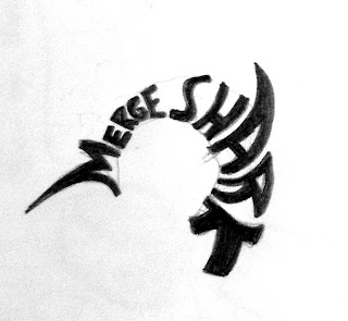
I thought I'd add this in here, as it was the largest job I've had regarding illustration yet and is still fairly recent too. Since the summer I've been in contact with a family friend who is starting a company called MergerShark and needed a logo designed for the official website. He asked my father and I to come up with several ideas to see if he could use any of them and after about a dozen different takes on the logo, he settled on this sketch:


Even though its MergerShark, with an "R". But that's alright. I admit, I've never done logo or graphic design work before, so vector art and making things look crisp and clean is all new to me. Either way, this is one of the first tries that I did with the logo, after adding in an eye and some teeth:


It was really strange having to convert my drawing into a vector-ized design, but after a few rocky attempts I was actually fairly pleased with it. Making letters in the shapes of shark parts was equally strange, especially the head. However, we had talked and after various drafts and he decided that this wasn't working in the way he was wanting it to and desired to take the logo in a different direction, so it was back to the drawing board during my stay in Fort Collins. I ended up with three alternate designs for him to use, and this was one of them:


It was back to vectoring for me, and after several trial and error variations on the design, we ended up turning MergerShark.com into an actual logo with color, outline, and a little fish.


I've got to say that this was one of the most challenging and serious projects for me, mostly because it was all new with vectoring and digitizing an image and all. But it taught me a whole lot about the work-in-progress of a design and was great experience for applying the illustrating process that I've learned in school to something more real (with thumbnailing, comping, and editing). And it also just taught me how to communicate and work with a client as well. I'd like to try this again in the near future, which might actually happen but with t shirt designs this time (will keep you posted on that one). Stay tuned.

Rough images and designs © Chris Loge 2010. Final design © MergerShark 2010. All rights reserved.

Planar Violence in Geometry Class!

This was my final for Acrylic Techniques and the method for this one wasn't so much technique as it was experimentation. Our goal was to use materials and work in ways that we've never worked in before, and the professor showed us videos about collage and painting on different surfaces. We also worked with a lot of stamping and gels and things like that. Quite the marshmallow project. 

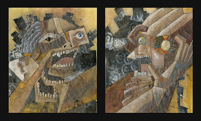
I've been wanting to expand the first idea I had come up with for the David Lynch's Hat album cover since the summer, having already finished the second idea. So I came up with a couple designs (we had to have at least two or three finished pieces that would work together as a series) and focused more on the cubist nature of them rather than the photographic poloroid-esque feel of the first draft. What I ended up with was a energetic strangulation scene, or a gross struggle between hunter and prey. Obviously because metal music makes me want to be violent towards people. No, its' just because the angular nature of the shapes really supports the idea of conflict and aggression. I kept with the idea of using random tidbits of realism on top of these new geometric shapes:


The final piece ended up being extremely time consuming, and the foundation for this particular technique takes so long to set up that I most likely won't pursue it in this particular fashion in the future. I ended up painting the background first with a sepia tone, then I took cut black-painted strips of vellum with white stenciled pattern over top and pasted them in the background, like an explosion. Then I cut pieces of "complicated paper" (collage-like newspaper and magazine clippings) and pasted them into the vague shape of the figures. I then painted on top of these papers to make them look more three dimensional before finally flailing ink sprays onto the canvas. What you see is what you get:


As I said before, making all of these surfaces and papers took days to complete, and it all had to be done before organizing them onto the canvas and actually painting on them. I'm fairly pleased with the final outcome, however the paintings need to be sealed or something because they're just too three dimensional (literally) that I fear pieces will soon fall off because of bad adhesive. I just remember the class complaining about this project more than anything, probably because it forced them to work in a way that they'd never consider normally. And I don't blame them, yet I also learned a lot.

All images and designs © Chris Loge 2010. All rights reserved.

Rad Toilet Paper Dispensers!

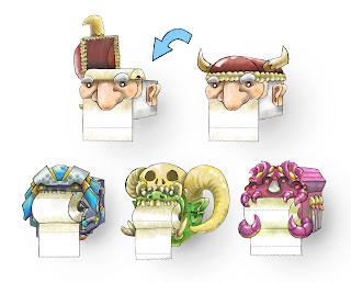
Our third project in Electronic Illustration was to design an art spot that was to be placed onto a common household object. For example, we were to do a drawing that could be placed on a laptop cover or a coffee mug or a welcome mat. I had several ideas such as door art, camping tent art, and different illustrated birdhouses. The idea that the professor liked the most however was a quick drawing I had done of a designed toilet paper dispenser/holder based off of various science fiction or fantasy characters:


Here's the final presentation of the dispensers, complete with a small diagram about how you could theoretically replace the paper:

My personal favorite is the orc character in the bottom middle. Anyhow, it was done completely digitally  and it was the first project that really showed me that I can be confident with digital painting, especially with Corel Painter over Photoshop. It really was an expansion of my style that seems to mesh well with what I've already developed with transparent paints mixed with bold line. If anything it makes the overall illustration feel cleaner and more modern, which is something I may end up permanently transitioning to in the future. 

We had to include this product in a scene where it could be easily found, but since I had designed the dispensers to have a different shape instead of just a flat image that could be wrapped around something, I opted to draw a bathroom with one of these little buggers in there:


One for every bathroom, kids.

All images and designs © Chris Loge 2010. All rights reserved.
I've Got A Headache!!

My third project for Acrylic Techniques forced me to employ a "squiggly line" technique, as well as utilizing graphite or ink alongside acrylic in painting. Well okay, not "forced", but I wasn't in the greatest mood when this project reared its head and so I give you my idea for this one:


Freakin' headache. I was thinking of all sorts of horrible imagery that would give someone a headache like this, so I came up with alien laser beams, a monster creating a fissure in his brain, nuclear mine fields, sword pokes, and a narwhale bursting from the forehead. I actually drew the sketch of that one in math class, but I admit that I always kind of wanted to do more of a simply cartoon-like illustration. You know, with the cop-out flat background with a character on top that seems to be all the rage amongst art students nowadays. Thought I'd give it a try.


The "squiggly line" can be seen in the skin of the guy's head, right before the brain is exposed. I suppose its just a way to create an interesting texture? Hardly a reason to devote an entire project toward it though. I substituted the sword for a chainsaw and made the narwhale into metal. The colors in the final aren't what I had originally went with, but were added in later as per the suggestion of the professor. The narwhale for example was originally more flesh toned, more orange, but it was decided that there needed to be more cool colors in the brain area so changes were made. Unfortunately this was one of those times that the changes suggested to me were not what I wanted in the final piece. I suppose that this painting was the definition of cop-out.

All images and designs © Chris Loge 2010. All rights reserved.

Goblin Shoppe

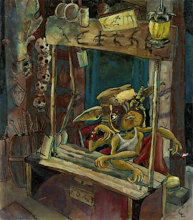
Our second assignment in my Acrylic Techniques class was for us to use a method in which we had to use different temperatures of warm and cool as a sort of layer in gouache underneath the actual painting. I had a sketch of a little goblin sitting in his shop from earlier, so I decided to use that for my final painting:

I don't know what the text says in his sign, but I wanted to make it look choppy, as if he had carved it onto the sign himself. As far as the technique goes, I chose to use a warmer orange gouache layer in the figure as well as in the lamp, and a swampier green layer for the rest.


And yes, that is a hydralisk skull from Starcraft in the background. This goblin is basically Jim Raynor, he's laid back, he's smoking, he fights zerg. And other humans apparently. Actually what I had in mind was more of a medieval fantasy setting for this one, instead of my usual machinery and techy jargon. He has four arms in the final simply because I couldn't decide on the positioning of how his two arms should go.

A classmate gave me good advice in the crit for this one: he said to get a clear focus in a painting with a limited light source like this, turn off the lights and hold a lit match or lighter up to where you want the light source to be in the painting. Then turn the lights on and paint it how you saw it with the lights off. I don't know, I had a tough time with this painting, mostly because of that colored under layer of gouache. I'm not the biggest fan of it, usually I like layers of transparent colors with a stronger line to pull it all together, but in this case I just couldn't get my colors together well enough. No matter how many layers I had put on top of the gouache, I kept seeing that swamp gouache-green peak through like a sketchy creeper in the bushes. Yep, that's it; gouache is a stalker. But not from Starcraft. (oh come on Chris, is anyone going to get that??)


All images and designs © Chris Loge 2010. All rights reserved.

David Lynch's Hat: Stuff and Things

I had been in contact with Edward Wersocki from the band David Lynch's Hat through my brother, who goes to school at the Berklee School of Music in Boston and we've been toying around with the idea of doing some work together on a demo album for his music since the summer. It was slow going, but I just listened to the music a few times and came up with a couple of ideas that I could have run with. I eventually narrowed it down to two:


Long story short, we both decided on the giant robotic head idea, mostly because it fit alongside their existential ideas and had an opposing oppressive sort of feeling. My idea was something along the lines of this giant metal human head in the center of this city: did the people construct this terrible monolith based off of an image of themselves? Or did it simply appear there one day? 

Well, school eventually started and the project was put on an indefinite hold. A few weeks in however, and it turned out that our second assignment for Electronic Illustration 2 was to do an album cover. I thought that it was the perfect opportunity to pick up the project again and finally finish the album artwork. I called Ed up and told him that either way, there'd be a new design for the Hat in two weeks. Here's the work in progress, perhaps halfway through. We decided to go with a more early New York City vibe for the structures, rather than the sci-fi theme from before. Our class had to employ a few traditional textures that we had made alongside a digital painting. If you look closely, you'll notice a few ink spots and pastel/charcoal textures in the sky and clouds:


I felt like it needed more bold colors, more reflections, more communist red. If it looks evil, make it more evil. This is the final album art, complete with my logo/font design and CD template: 


I showed Ed the album cover and he was stunned, in the good way, and immediately showed Slightly Depressed Luke (other band member). Before I knew it, he sent me an email saying that they both gave it a 10 out of 10 and are going to use it on the actual album. Sweet.

This project really pushed me out of my comfort zone, mostly because it was done as a digital painting first and had a clear focus toward showcasing something that wasn't necessarily mine, which was the music. I had to make the art compliment the tunes as I heard them, which is the strange thing about album covers actually. Whenever I listen to music that I know the album art to, I always am reminded of that art as sort of the true testament to what I'm hearing and so that was the major pressure in doing this work. But I had a blast making it and gosh darnit I sure love me some metal so it really was a dream project for me. 

Here's a couple links to their site and also their Myspace. You can download the music for free, so get on that!

http://www.myspace.com/davidlynchshat

All images and designs © Chris Loge, David Lynch's Hat 2010. All rights reserved.