Saturday, April 9, 2011

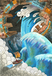
And the earth shakes...!

And finally, my final for portfolio, which stands in at number three in my series of elemental paintings. This time, I used minimal moving parts in that there are only a few layers of cut-out paper instead of layers-upon-layers like in the previous two. I suppose that I was wanting to prove to myself that I could still draw with this one, instead of relying on a gimmick, if that makes sense. 


I'm proud of this one; I spent a lot of time on the different aspects of the ink drawings. I was trying to see how differently-rendered objects placed next to each other can appear, using pen-and-ink style against my cartoony-painting style. Maybe one day I'll pick up this series again; I really had a great time with these.

Links to the previous two paintings in the series:
http://chris-loge.blogspot.com/2011/03/ah-my-second-portfolio-piece-in-my.html
http://chris-loge.blogspot.com/2011/02/my-goose-is-gettin-cooked.html

Facebook: The Consumer's Beast of Burden, an editorial illustration

Here's my final for Type and Image. It's an editorial piece, so we had to research articles and figure out what we'd like to focus in on. I had read an article a while back about companies essentially using facebook as their main source of advertisement and as a result, facebook becomes more and more burdened (and dictated) by third parties. This wasn't my first choice for a piece actually, but that's sort of the process when it comes to editorial work; sometimes it takes a really long time to get motivated by just the news and research and other times you end up going with your third or fourth idea.


Lava Chicken!

Our third project for Type and Image was a package design, any image we wanted that went along with type, as per usual. I chose hot sauce because I remember seeing all sorts of crazy hot sauce bottles back in Fort Collins. What I ended up with was this:


I admit that I really struggled with this one, mostly due to the fact that I had never used layouts or formatted different sides of a box. It was difficult to figure out where things would be placed on which side, what to put on all of the sides, etc. I still like the character though.

Tuesday, March 29, 2011

Mouth of the Ocean

Here is my second portfolio piece in my "mythological creatures" series.  This painting was centered around the element of water, and I wanted the creature this time to look quite different from what we've seen in the previous one. As before, I wanted the monster to look ancient, almost like statue or an idol. But unlike the previous small fire-ant creature from before, the water-spirit is  more like a giant monolithic building that towers over the skies and pours waterfalls from its mouth:


The process this time was much less cumbersome than before, and I was able to completely render out all of my pieces prior to gluing them down. This one was much easier, mostly due to the fact that the layering is much more simplified than before and I found that this is relieving to approach when you use large surfaces that are all treated and prepared differently.
Also, I have to say that I was deeply influenced by The Legend of Zelda: Wind Waker with this painting. I liked the notion of adding in that human factor to these, and the lone sailor idea really was a great fit for this sort of thing.

Here's a link to the first piece in the series:
http://chris-loge.blogspot.com/2011/02/my-goose-is-gettin-cooked.html

The Sentient Bean coffee house scrabbles

My fourth and final postcard assignment can be traced back to our class' field trip day where we ventured to the nearest coffee shop and sketched inside. There was an especially colorful woman sitting at a table in front of mine, furiously typing away at her computer with this especially crazed expression. A classmate and I decided to draw this woman for our projects, which were just hilarious. I did a few other caricatures of some others in the shop as well:


I wanted to work in a new way with this one on the computer. I was aiming for the most "digital-looking" painting I could away with, and I ended up liking this process quite a bit. The cleanliness of it all was a fun way to approach values, and restricting myself to one or two tones per area was a challenge. But I like this one and I might do more like it.

Dream sucker squeezer apparatus...

This was my third postcard assignment from my portfolio class. We just had to create a piece, really without any limitations other than for the overall dimensions. The idea for this one spawned from a sketch that I had done, originally as a character design for a resource for my upcoming fighting game:


He's a big yellow slug-like monster that lives under your bed. At night, he eats your dreams. He controls a dream puppet in order to manipulate your subconscious and to sway your dream sequences which changes the flavor of the dream. His favorite dream flavor is a chase scene nightmare.

Saturday, February 19, 2011

"My goose is gettin' cooked."

     My Portfolio Development class is having us choose a "thematic style" or aesthetic for a series of pieces over the course of the quarter. After thinking over a few ideas, the choice eventually landed on a more graphic cut-out technique as well as being loosely influenced by the term "mythology" and the "elements". So that's where I sort of took off with it; I started with a few sketches of what I thought a "fire creature" would look like, as well as a couple of other elements. Here's what I came up with:


     I had a hell of a time with this one because (as mentioned in the planar portraits project) the process requires so much preparation of the differing textures and surfaces that I spent hours just getting to the point of putting paint on something. But I also am really pleased with how it turned out. The creatures from the sketches ended up becoming these diving machine creations that are causing all sorts of destruction with their element. I like the idea of the fire-machines being these really tall gangly things that are able to shoot while walking over the flames and destruction on stilt-legs. Experimenting in a portfolio class might not be such a bad thing after all. Still, I'd say this one is draws heavily from my Three Musketeer illustrations from over a year ago.