Sunday, July 10, 2011

My Postcard

Speaking of the robot theme that I've been on for the past few months, I decided to create my official postcard with them in mind. Painting this was a challenge; I had an especially hard time with the colors, though I feel that the composition is quite nice.


Here's the back of the postcard. You'll notice that I've recycled my piece from earlier, as it fits this particular card perfectly. Oh, and that address is old, in case anyone was wondering. Also! You can find one of these right here in Savannah, in the bathroom of Gallery Espresso along with dozens of other artists postcards!


SCAD Bus Wrap Robots

Woah. I'm officially graduated from SCAD as a Bachelor of Fine Arts in Illustration, and I've been very busy moving into my new apartment in Savannah, as well as looking for and working a part time job. So I'm finally trying to keep my blog up to date. Well that's only partially correct; the overhead design label on this site has been redone to match my current marketing theme, but I'll post some recent work that I've done in my final weeks as a SCAD student. Do you like the red robot guy as my logo? 

Speaking of robots, our third assignment in the Advertising Illustration class was to design a bus wrap image, hypothetically for SCAD to use on their new vehicles. At this time, I had just finished the game Machinarium for the PC and the art style left such a heavy impression in my mind that I had to tip my hat in its' favor with this piece. We had to design both the side, and the back of the bus, and this is what I ended up with.

Side art:


Back art:


And here's the final product, with the art wrapped onto the bus templates, the SCAD logo, and a few words that were required to be placed somewhere on the vehicle. Fun fact, I seem to have messed up somehow on the dimensions, having not included the bumpers in my calculations, so I ended up stretching the art on the side panel in order to fully fit the entire side of the bus.


Seriously guys, go download and play Machinarium right now and you'll see what I mean. 
Here's a link to their official site: http://machinarium.net/demo/

Monday, May 16, 2011

Clevah Garlll....

Our first project in my Advertising Illustration class was a mock commercial ad for a new dinosaur exhibit at the Natural History Museum. The only requirement was that we had to include the front of the museum somewhere on the illustration (and it had to fit the National Geographic template).

I decided to continue the style that I had used in my previous illustration (with the earth monster). I liked the idea of having areas of color placed around other elements that were left white, and I'm still attached to the process of creating the sky layer in the background (with rubber cement and salt and the like).

Saturday, April 9, 2011

And the earth shakes...!

And finally, my final for portfolio, which stands in at number three in my series of elemental paintings. This time, I used minimal moving parts in that there are only a few layers of cut-out paper instead of layers-upon-layers like in the previous two. I suppose that I was wanting to prove to myself that I could still draw with this one, instead of relying on a gimmick, if that makes sense. 


I'm proud of this one; I spent a lot of time on the different aspects of the ink drawings. I was trying to see how differently-rendered objects placed next to each other can appear, using pen-and-ink style against my cartoony-painting style. Maybe one day I'll pick up this series again; I really had a great time with these.

Links to the previous two paintings in the series:
http://chris-loge.blogspot.com/2011/03/ah-my-second-portfolio-piece-in-my.html
http://chris-loge.blogspot.com/2011/02/my-goose-is-gettin-cooked.html

Facebook: The Consumer's Beast of Burden, an editorial illustration

Here's my final for Type and Image. It's an editorial piece, so we had to research articles and figure out what we'd like to focus in on. I had read an article a while back about companies essentially using facebook as their main source of advertisement and as a result, facebook becomes more and more burdened (and dictated) by third parties. This wasn't my first choice for a piece actually, but that's sort of the process when it comes to editorial work; sometimes it takes a really long time to get motivated by just the news and research and other times you end up going with your third or fourth idea.


Lava Chicken!

Our third project for Type and Image was a package design, any image we wanted that went along with type, as per usual. I chose hot sauce because I remember seeing all sorts of crazy hot sauce bottles back in Fort Collins. What I ended up with was this:


I admit that I really struggled with this one, mostly due to the fact that I had never used layouts or formatted different sides of a box. It was difficult to figure out where things would be placed on which side, what to put on all of the sides, etc. I still like the character though.

Tuesday, March 29, 2011

Mouth of the Ocean

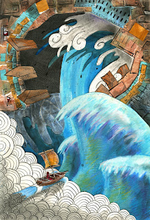
Here is my second portfolio piece in my "mythological creatures" series.  This painting was centered around the element of water, and I wanted the creature this time to look quite different from what we've seen in the previous one. As before, I wanted the monster to look ancient, almost like statue or an idol. But unlike the previous small fire-ant creature from before, the water-spirit is  more like a giant monolithic building that towers over the skies and pours waterfalls from its mouth:


The process this time was much less cumbersome than before, and I was able to completely render out all of my pieces prior to gluing them down. This one was much easier, mostly due to the fact that the layering is much more simplified than before and I found that this is relieving to approach when you use large surfaces that are all treated and prepared differently.
Also, I have to say that I was deeply influenced by The Legend of Zelda: Wind Waker with this painting. I liked the notion of adding in that human factor to these, and the lone sailor idea really was a great fit for this sort of thing.

Here's a link to the first piece in the series:
http://chris-loge.blogspot.com/2011/02/my-goose-is-gettin-cooked.html

The Sentient Bean coffee house scrabbles

My fourth and final postcard assignment can be traced back to our class' field trip day where we ventured to the nearest coffee shop and sketched inside. There was an especially colorful woman sitting at a table in front of mine, furiously typing away at her computer with this especially crazed expression. A classmate and I decided to draw this woman for our projects, which were just hilarious. I did a few other caricatures of some others in the shop as well:


I wanted to work in a new way with this one on the computer. I was aiming for the most "digital-looking" painting I could away with, and I ended up liking this process quite a bit. The cleanliness of it all was a fun way to approach values, and restricting myself to one or two tones per area was a challenge. But I like this one and I might do more like it.

Dream sucker squeezer apparatus...

This was my third postcard assignment from my portfolio class. We just had to create a piece, really without any limitations other than for the overall dimensions. The idea for this one spawned from a sketch that I had done, originally as a character design for a resource for my upcoming fighting game:


He's a big yellow slug-like monster that lives under your bed. At night, he eats your dreams. He controls a dream puppet in order to manipulate your subconscious and to sway your dream sequences which changes the flavor of the dream. His favorite dream flavor is a chase scene nightmare.

Saturday, February 19, 2011

"My goose is gettin' cooked."

     My Portfolio Development class is having us choose a "thematic style" or aesthetic for a series of pieces over the course of the quarter. After thinking over a few ideas, the choice eventually landed on a more graphic cut-out technique as well as being loosely influenced by the term "mythology" and the "elements". So that's where I sort of took off with it; I started with a few sketches of what I thought a "fire creature" would look like, as well as a couple of other elements. Here's what I came up with:


     I had a hell of a time with this one because (as mentioned in the planar portraits project) the process requires so much preparation of the differing textures and surfaces that I spent hours just getting to the point of putting paint on something. But I also am really pleased with how it turned out. The creatures from the sketches ended up becoming these diving machine creations that are causing all sorts of destruction with their element. I like the idea of the fire-machines being these really tall gangly things that are able to shoot while walking over the flames and destruction on stilt-legs. Experimenting in a portfolio class might not be such a bad thing after all. Still, I'd say this one is draws heavily from my Three Musketeer illustrations from over a year ago.

Sunday, February 13, 2011

Avast! A Self Portrait!

   This is the second "postcard" assignment from my portfolio class, the restriction was that we had to work in the style that we'll be approaching our final pieces of the class with. Our instructions were to paint our "alter-ego" in that style, in any medium and format. So, I drew up a couple of ideas and came up with this painting for a self portrait:


   There's a strange thing that keeps happening whenever I try to post this particular picture online because the colors always dull out. Maybe its' because the JPEG version has to cut a few corners, who knows. But I've tried several times to amp up the vibrancy in the colors and it always comes out looking a little flat. 
   This painting is the absolute direct result from me working digitally over the past year. For some reason, I can't seem to grasp the concept of putting paint down on canvas anymore; I have to work in layers for it to make sense to me. Everything on this painting is a cut-out shape that had been arranged and pasted together, which is more of a refinement from the planar portraits that I had done last quarter. To me, this painting felt like a stepping stone as far as the way I approach the working process. 
   Its' almost a combination of painting, collage, and digital refinement wrapped in one, and while working in this way cannot accomplish any of those particular things fully, I'm finding that it offers a couple advantages that is unique to the cut-out shape process. For one, because I am using the cut shapes, I'm able to arrange things exactly how I want them to look as I'm working, rather than planning everything out beforehand. This leads to a more spontaneous composition, which is like a godsend because I think I've always resisted the planning stages more than anything else while painting. Second, I was also able to paint with hard, defined edges that would take very careful precision if I were to paint them all regularly.
   The downside of course is that it is difficult to create contrasts because everything is created separately from each other. Without having everything around it to compare to, colors and value tend to go wherever they please, and the whole painting as a whole could have trouble feeling unified without touching it up in Photoshop afterward. That, and my arm fell off from the strain of cutting out the shapes, and my x-acto knife literally exploded from overuse. Now I only have one arm left, and a broken x-acto knife to cut it off with.

After Dark

Ah, finally I have time to be able to update a little more from my final year at SCAD. I've been almost constantly chipping away at several projects at once, but the first recently completed piece is a book cover for our Type and Image class. Embarrassingly, I hardly ever read, so my library of books that I had to chose from was limited to say the least. One book that I remember fondly though was After Dark by Murakami. Without going into any details because it is in fact quite late, the book to me was more or less about the night life of Japan that essentially became an organic being; there was something almost sentient about it that seemed to encapsulate everyone underneath. Here were four early sketches from the beginning stages: 

The first and the fourth ideas were the strongest, though since I felt that the first idea had been done over and over again, I decided on the last. This painting, in more ways than any other piece before this, really cemented in my head the digital process. Except for the sketch and a few textures, the piece was done completely in Photoshop and Painter in the same vein as my DLH album cover. Also, with this I feel like I have the strongest grasp on painting when it is done digitally, as if my ties to traditional media have been permanently cut (which is something that I am learning the hard way, as shown on a painting that I am currently working on). As I'm sure everyone saw coming, this painting is very dark and as a result the print-out version looked terrible. But, that was expected. I'll post the digital version so you can get a better grasp of what I was going for. I wanted to capture the feel of city-night in a more conceptual way, and there was a small debate about which way the "legs" should be facing.

Here is the final piece. Mind the lorem:


Wednesday, January 26, 2011

"Shut down all the garbage smashers on the detention level!"

I'll be posting my projects that I'm doing as well as smaller exercises and assignments if I feel like they're worth noting. This particular piece was a postcard that we had to design with an emphasis on either "risk" or "safety". In keeping with my machinery binge that I've been clinging to lately, I decided to collage bunches of differently rendered pieces of machine together in layers in order to make the looming trash pile look more dense. The bottom layer is a neutral medium grey value with stacks of either painted or inked layers on top. And of course there are my little Jetsons/Despicable Me-esque robots down there:


I like those little guys. One of my classmates said that they are male and female robots, and the male one is trying to impress the female one.

Why Can't I Quit You, Siege Tank?

Ah, finally the first update in a while! I've already spearheaded my way into winter quarter 2011 at SCAD and have just completed my first legitimate "project" in my Type and Image class. Here we had to design three of our own custom letters. After playing around with a few different aesthetics for my letters (including tribal, fantasy, and haunted house), I eventually settled on robots and technology for my overarching theme.
I did the pieces completely digitally using Photoshop and Corel Painter and with it, this project cemented my initial feelings for this kind of art that I had first felt back when doing the "toilet paper" assignment last quarter. I really do accept the digital medium in my art now, and actually I am beginning to prefer it to any other method of working. There are just certain things with painting digitally that are much more convenient and plain easy when compared to traditional painting technique. Needless to say, I am looking at purchasing my own tablet in the near future... 
I spent quite a while on these and I'm actually pretty proud of them. They remind me a lot of Terran structures from StarCraft, as I had that sort of design in the back of my head when figuring out how I would create the letters.


Our professor required us to go out and print our designs and mount them on black board. I decided to print them all out on the same canvas in order to make matting easier. Here's how they looked in arrangement when I printed them together: